Brand
Moonrig Brand Identity
More than a platform — a movement powered by data, design, and deep conviction in the decentralized future.
Our brand identity is a visual and verbal extension of our mission. It signals trust in a chaotic world, clarity in a sea of speculation, and community in a universe that often feels fragmented.
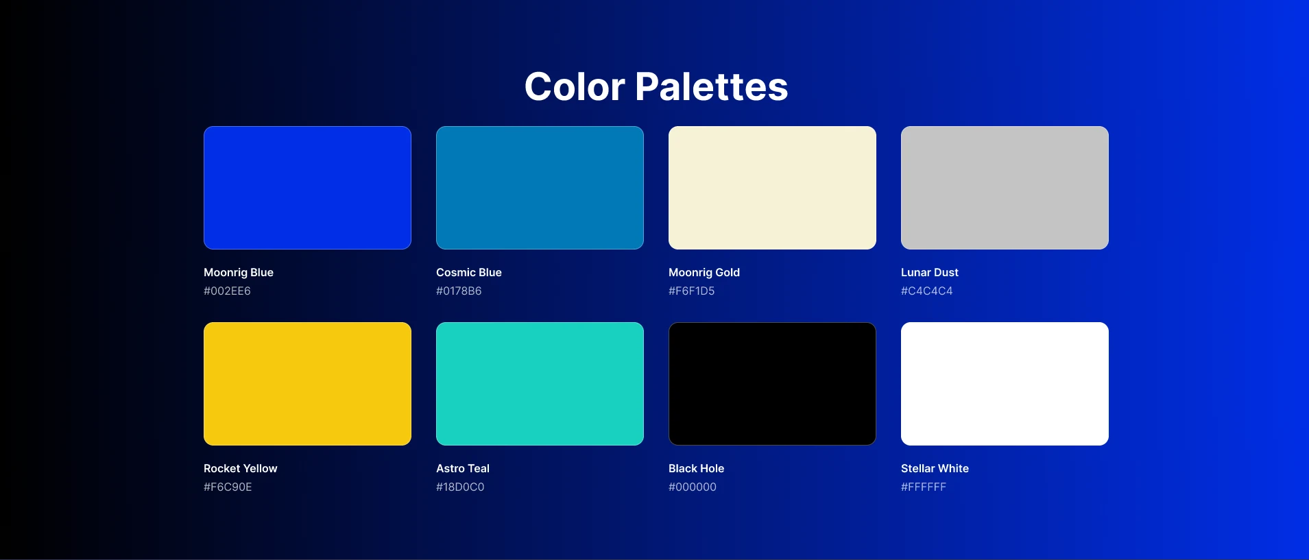
At the core of our identity is a commitment to “Turning Intelligence Into Strategy.” Every color, typeface, and design element reflects the intelligence-driven, user-first philosophy that defines Moonrig — from our rocket-inspired logo to the cosmic hues of our palette.
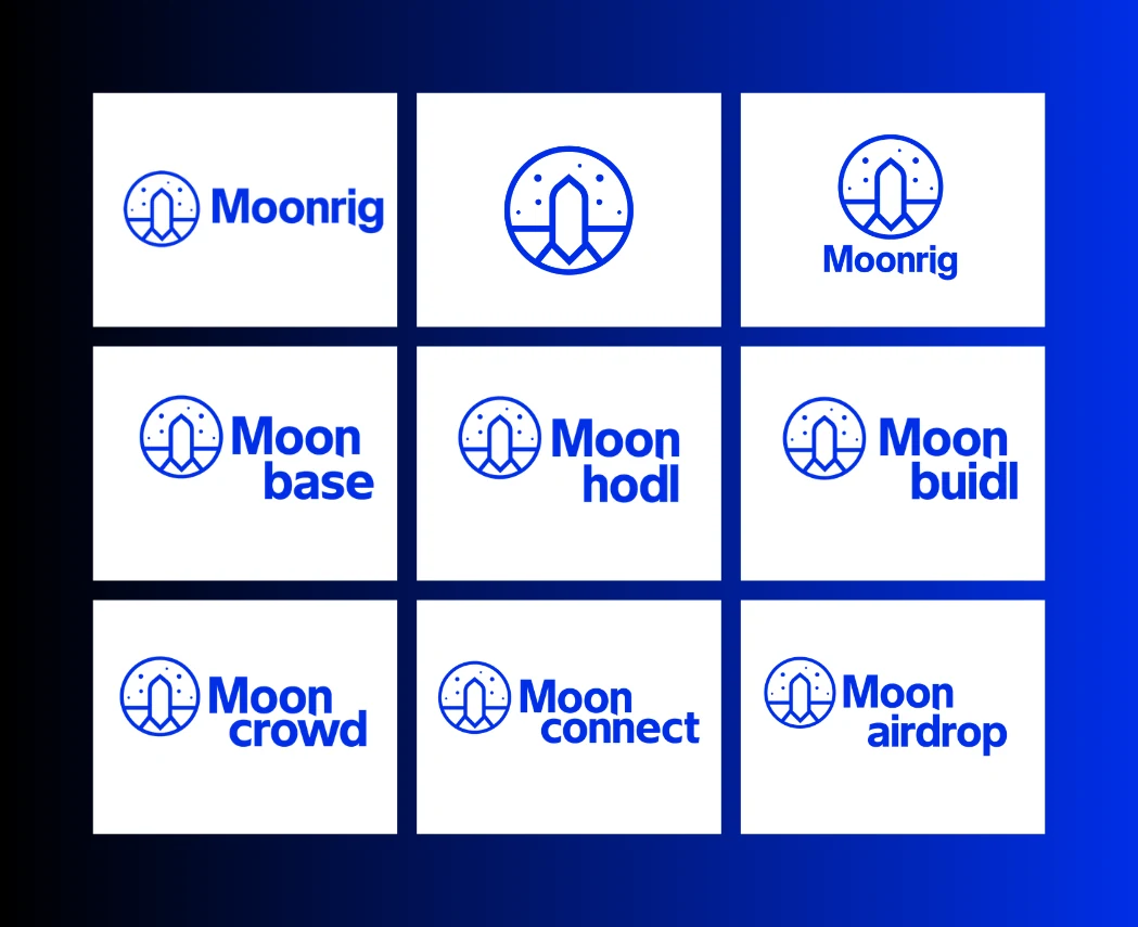
Download Brand Assets (.zip)Logos
Primary marks, icon-only variants, and lockups — also bundled in the brand assets download.
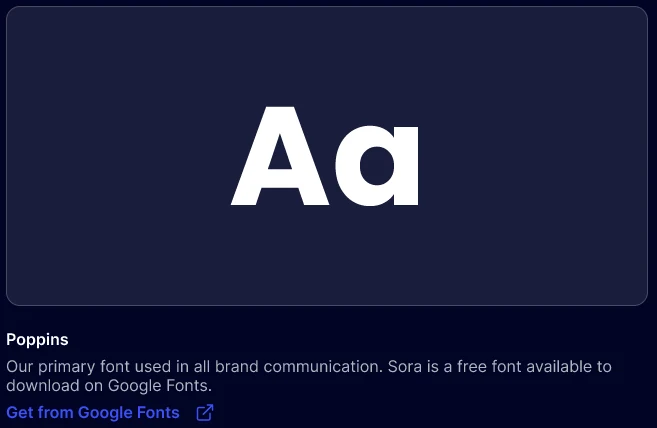
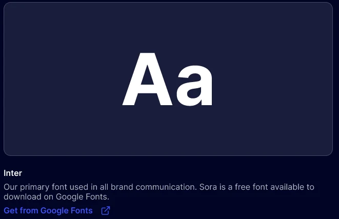
Typography
Poppins is our primary typeface — geometric clarity and forward momentum. Inter handles secondary and technical contexts.
Usage Guidelines
- Do not alter, stretch, rotate, or create your own version of the logo.
- Always leave enough clear space around the logo to ensure visibility and prominence.
- Use only the colors, typefaces, and marks provided in our official brand kit.
- Maintain consistency in all digital, print, and product applications.
Press or partnership inquiries: reach@moonrig.io.